It’s a new year and many chiropractors are evaluating what will enhance their respective practices, particularly as it relates to their bottom line. One of the most common questions I get is: “Do I need to be credentialed to bill insurance, and what are the best plans to join?” It’s a loaded question – but one every DC ponders. Whether you're already in-network or pondering whether to join, here's what you need to know.
Chirologomania, Part 2 of 2
This continues my look at the phenomena of the chiropractic logophiles of the 20th century and their creations. Let's resume with the images of winged hands and lamps, long popular among chiropractic institutions and agencies:
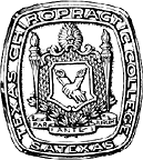
Emblem of Texas Chiropractic College, 1930s.

A medallion struck to commemorate the CCE's first 50 years.

Emblem of Lincoln Chiropractic College, 1971.
Some institutional images have undergone metamorphosis. For example:

An abstract angel emblem of the LACC, 1980s and 1990s.

The LACC logo of the 1990s preserved something of the earlier abstract angel.

Vitaminerals employed this emblem for many years.

The angel's wings were indistinguishable from arms when LACC
became Southern California University of Health Sciences.

Original emblem of Canadian Memorial Chiropractic College (CMCC),
circa 1945.

CMCC has employed this derivative emblem for more than 50 years.
Some images and emblems have looked no farther than an institution's name or initials for inspiration:

Emblem of Anabolic Laboratories, a chiropractic supplier, circa 1969.

Vitaminerals employed this emblem for many years.

National College of Chiropractic deviated from its
earlier themes in this 1940 emblem.

Emblem of the Columbia Institute of Chiropractic, 1945
(forerunner of NYCC).

Logo of Pacific States Chiropractic College, circa 1978
(forerunner of Life College West).

Logo of Northern California College of Chiropractic,
circa 1978 (forerunner of Palmer College West).

Emblem of the Council on Chiropractic Education (CCE), 1990s.

NCMIC's initials sprouted a single wing.

The emblem of the Eastern Chiropractic Institute, 1929-30
(forerunner of the Chiropractic Institute of New York)
coupled initials with a vertebra and ribbon.

This early emblem of Cleveland Chiropractic College of Kansas City,
circa 1926, remained in use for many years.
The images from the Palmer school have been relatively stable and original:

The Palmer wyvern at attention...

... and adopting a more relaxed posture.
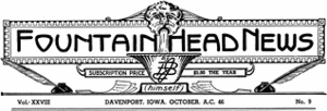
This image graced the front page of the Fountain Head News,
edited and published by B.J. himself for many decades.
Some images probably merit awards for originality, and some, perhaps, for inscrutability:

Emblem of Triton Insurance Company, a California malpractice writer
that challenged NCMIC in the 1960s.

Emblem of Logan Basic College of Chiropractic, mid-1950s.
My favorite logos are those employing images that seem to relate directly to the product, service or message being delivered:

Emblem of Pacific College of Chiropractic, 1910
(forerunner of Western States College).

This image appeared on early editions of William Trever's (1972)
expose of AMA documents dealing with efforts to "contain and eliminate"
the chiropractic profession.

This emblem for Activator Methods, Inc., was used for many years.

The Foot Levelers emblem has stood the test of time (pardon the pun),
and readily communicates the focus of the company's products.

A more recent symbol of Activator Methods, Inc.
However, the emblem that I would commend most highly for its simplicity, ingenuity and visual appeal is the one for Sherman College of Straight Chiropractic (SCSC):

The emblem of the SCSC suggests the flow of innate intelligence:
from above to down, and from inside to out.
References
